08/08/2011
Elegance & Illustrations Reception
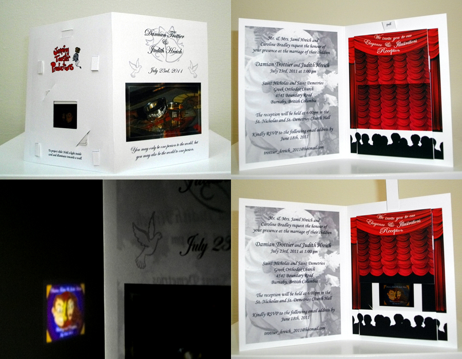
Yesterday, I posted some images of my wedding invitations in different stages of completion. Today shown above is the finished product which was mailed out to our friends and family. Everyone commented on the originality of the wedding invitation and inquired on how I made such a thing and how much time was involved?
I started working on the invites in December 2010, which was mainly illustrating the caricature which would be photographed and used in the slide inside the card. I can’t tell you how difficult it is to create a complimenting caricature of someone you love where all your family members are going to see it and not be insulted. I went through quite a number of different sketches before my love selected the final. Doing a caricature of myself was the easiest thing to accomplish, as a cartoonist I have drawn myself as a cartoon character in some form or fashion. After the final illustration was completed I scanned them onto the computer and created the ‘Looney Tune’ backdrop which would complete the image. Keeping the theatre theme in mind (Elegance & Illustrations) I chose the bright ‘Looney Tune’ circles as the background as there was always a cartoon featured before the movie which tied the theme together nicely. After a quick trip to the print house to get a blown up version made of the graphic, I took it to my photographer to have the pictures turned into the film projection slides which would be fitted inside the card.
I asked my fiancé what other images we should place on the card as her input was always highly regarded. She chose the photograph my good friend the photographer (Mark Efford) took of our engagement rings which was used on the cover of the invitation. To complete the card she chose a nice picture of a ‘Saint’ of which the name escapes me at the moment, which I faded behind the text of the address inside opposite the red curtain. The back portion of the card had to remain empty as this is where the card would be cut to hold the projection slide and cut marks to fit the moving parts. But as always I shamelessly put my Jumping Toaster logo on the back so that everyone would know I created the card!
Each card was printed on an 8 ½” x 11” white card stock and cut in half and scored. The top portion was used for the moving parts which I cut out with a cutting board and scissors and the bottom portion was the actual double sided printed card which was cut with an Exact-O blade to fit the moving parts. Each card took roughly 10-15min to make from start to finish and there were roughly 75 cards mailed out. All in all the project came out quite well and everyone seemed to really enjoy the card! Many were really impressed that you could take an ordinary flashlight and project the image on the wall, which of course was the whole reason why I created the card in the first place. The photo above illustrating this came out quite poorly, but tomorrow you will see the graphic as I had it printed for the slide in its entirety.
Enjoy!
ALL MATERIAL IS COPYRIGHT PROTECTED! Unless otherwise provided in writing from Designer. No person(s) may not make or permit alterations or manipulations of images beyond the requirement of slight or reasonable image enhancement (i.e. alterations of contrast, brightness, color balance, re-sizing, and cropping), consistent the reproductive needs, that do not materially change the integrity of any image. Alterations or manipulations include but are not limited to additions to, subtractions from, or adaptations, alone or with any other material.

August 11th, 2011 at 4:56 AM
Thanks for using the time and effort to write something so interesting.
My site:
dsl anbieter vergleichen http://www.dslvergleichdsl.com